Tuesday 27 November 2007

FINAL PHOTOS

These photos are the final product, they display graffiti style male breast cancer facts in them which I have produced using photoshop. I decided to have the male breast cancer facts in there because it answers the "it affects us too" question which people may ask when looking at the t-shirt and display boards. I wanted to have two boards displaying the logo and "it affects us too" question getting sprayed on the wall and the other two display boards to have the facts on. The photo shoot also displays clearly the front and the back of the black and white t-shirts.

PHOTOSHOOT TRIALS

These are just some practise photo's I did which I really liked but there wasn't really any meaning behind them. The Graffiti theme really worked in these pictures so i decided to take some more.


PHOTOSHOOT

My idea for my photo shoot was to create something dark and controversial, so I experimented with trying to photograph a male and a female in one of the printed t-shirt's....but unfortunately it did not work, so I tried to use the female to shadow to the male in the photo but that didn't work either.
After experimenting with the male and female idea, I decided to come from another direction.
Because the T-shirt was to create awareness about male breast cancer, I still wanted it to be a little controversial , and ended up keeping in continuity with the style and theme of the t-shirt [A graffiti theme].


Tuesday 13 November 2007

ITS NOT OVER YET!

After a critical analysis of my final designs, I decided that my angle "breast cancer in men" was not directed enough towards men. The reason for this was use of the male and female symbol. So I decided to take the female symbol out of the design a more personal approach towards men. but kept the female symbol in the tag line because as much as it aimed towards men, Breast cancer research is aimed at both.
I also placed the main target design over the breast area of the t-shirt, and added the "Fashion Targets Breast Cancer UK" on the back at the bottom of the T-Shirt.

Friday 9 November 2007

FINAL THOUGHTS

I used the feed back I got from the River Island Customers and changed one of the designs because most of the people I asked wanted a combination of the two designs. I tried and tested one and went back to ask some of the staff and customers to see which one worked best.................guess what one I combined came through the strongest?

BACK TO BASICS

For further market research I decided to approach some male River Island customers to see what designs stood out from each other and if they would be suitable in River Island. I explained to them where I was coming from [Shock value, male/female symbolism/ it affects us too] and what one would be more commercial in the shop.
The most popular ones by far were these two:

FINAL IDEAS

After some final thoughts on my work and criticism from lecturers and colleagues I have decided to leave out the face and work heavily on the male and female symbolism.

Here my four final designs I have worked on:


Monday 5 November 2007

T-SHIRT DESIGNS

Here are some early T-shirt designs:

Thursday 1 November 2007

TWO FACE

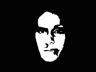
The original idea of the half skull and half face was too dark and not relevant to breast cancer at all. I decided to design a half man and half women face instead because it related to the tag line "it affects us too". I used the same method i used to design the skull.

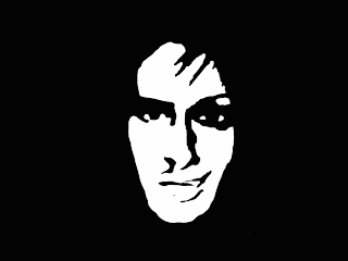
  • Desaturate the original photo

  • Change the brightness and contrast to make the image block coloured black and white.

  • Go to the filter gallery and stamp the image changing the smoothness of the photo.
  • Invert the image so the face is white and surrounding is black.

  • Cut one side of the face in half and blend the two faces together adjusting the dimensions of the two faces.

  • Touch up the faces by rubbing out and painting selected areas.


TAG LINE

I have been working on the Tag line and have finally decided on the font, its quite a disturbing font called FORM FOUND which i got off the Da Fonts website. On the t-shirt, i decided to use three colours [black/white/red] which really stand out, so I experimented with a few.


TARGET IDEAS

I have come up with some colour ideas for the breast cancer logo:

The one I chose to work with was:
I then experimented on the target by using the MALE and FEMALE symbol to some how incorparate it into the logo: